
When Fuel TV transitioned from an independent broadcast concept into a full-scale global channel under Fox Corporation, the brand faced a rare and delicate mandate.
The identity had to feel underground, daring, and culturally fluent in action sports, while also launching with the structure required for immediate global adoption across broadcast, digital, and print partners.
There was no appetite for a traditional rollout. No phase-one logo followed by phase-two rules.
The brand needed to arrive fully formed, expressive and operational from day one.
Brands & Brawn was awarded the project because of our deep experience developing identity systems for action sports and youth-driven brands, where authenticity is fragile, culture evolves rapidly, and conventional branding frameworks actively work against credibility.


Built Outside the Corporate Playbook
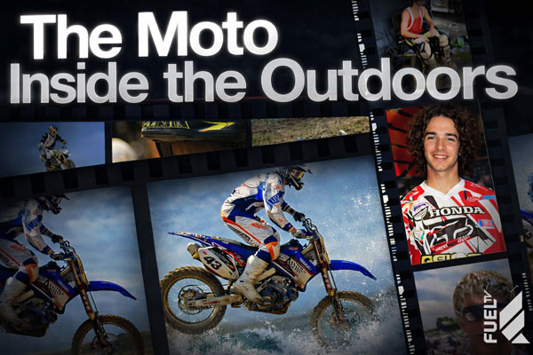
Fuel TV originated as an independent weekly television series centered on action sports and music, launched in 2001 on a local broadcast affiliate. Its appeal was rooted in proximity to real scenes, real athletes, and real subcultures that existed well outside mainstream media.
By 2003, the concept expanded into a full-time cable and satellite channel with global reach. While distribution scaled rapidly, the audience did not change. Fuel TV continued to speak to a generation deeply skeptical of mass media and highly sensitive to anything that felt manufactured.
The brand could grow. But it could not behave like a network brand.
That tension defined the entire identity challenge.
An Anti-Brand by Design
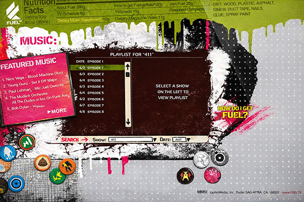
From the outset, Fuel TV rejected the conventions of traditional broadcast branding. Rather than relying on a single fixed visual system, the identity embraced constant variation, imperfection, and evolution.
The visual language drew inspiration from early digital culture and emerging online aesthetics, including:
The brand was designed to feel alive, disposable, and in motion, mirroring the pace and unpredictability of action sports culture.
Consistency was not achieved through repetition.
It was achieved through shared intent.
At the center of this system was a single unifying signal: the Flying F.
Brands & Brawn developed a complete identity system designed around discipline, performance, and integrity.
Brand Identity & Visual Language
Packaging System
Motorsports & Experiential Integration
Every touchpoint was engineered to reinforce the same message: performance with integrity.

Integrity Energee launched with immediate national visibility through IndyCar, entering the market with a level of polish and cohesion typically reserved for far more established brands. The identity system allowed the brand to:
While Integrity Energee was ultimately a short-lived product in a brutally competitive category, the work stands as a clear example of Brands & Brawn’s ability to build complete, high-stakes brand systems under real-world pressure, where clarity, consistency, and execution matter as much as creativity.
An Icon for an Iconic Youth Brand
The Flying F logo did not exist in isolation.
It launched simultaneously with the brand identity guidelines as part of a single, integrated system.
From day one, the mark and the rules governing its use were developed together. The Flying F was never treated as a precious or static asset. It was designed to move across platforms, formats, and regions without losing its core integrity.
Brands & Brawn ensured that:
Rather than enforcing surface-level consistency, the guidelines defined structural principles, intentionally preserving creative freedom everywhere else.


A Global Brand That Never Looked Corporate
With the Flying F and brand guidelines launching together, Fuel TV entered the global market with an identity that was immediately recognizable, immediately usable, and immediately credible.
The brand scaled across broadcast, digital, and print without losing its raw edge. Partners gained clarity without restriction. Most importantly, the audience never felt the presence of corporate branding shaping the experience.
Fuel TV proved that a brand can launch fully formed without ever feeling finished.
Action sports brands do not succeed by tightening control. They succeed by protecting belief.
This case study reflects Brands & Brawn’s defining strength: designing identity systems that launch with culture embedded, scale without dilution, and give creative partners room to move while keeping the signal intact.
We don’t build brands to look correct. We build them to stay real.